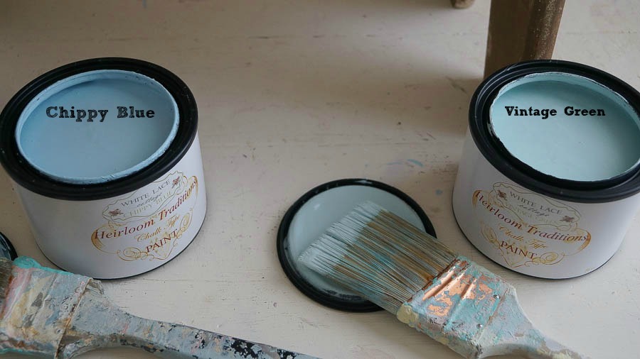
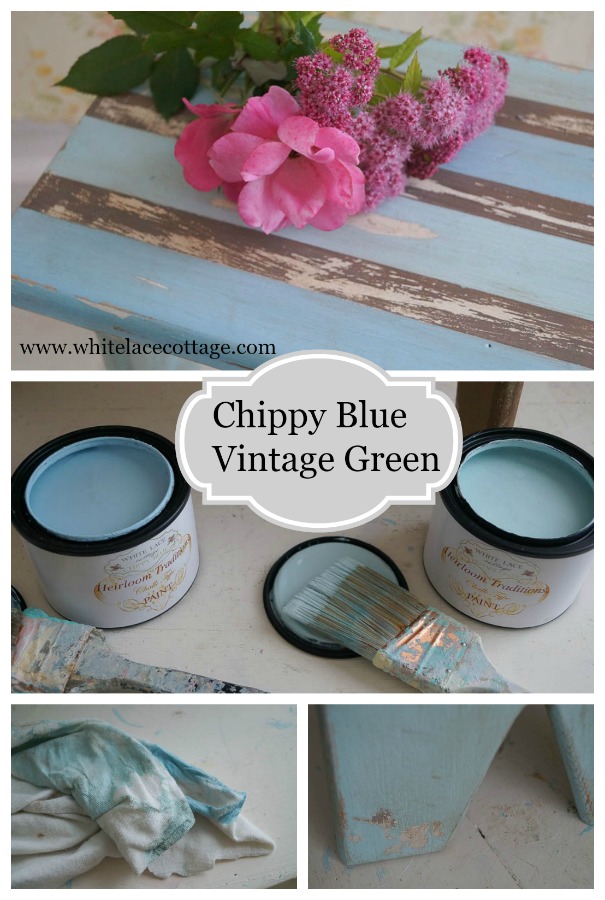
Let’s talk about Chippy Blue and Vintage Green.
As you know those are two of the colors in my signature paint line.
Lately I have had a few questioning the difference between the two colors.
When I created this paint line I wanted really soft muted pastel colors.
Chippy Blue represented my love of chippy paint, and those amazing old vintage blue pieces we find at the flea markets.
As for Vintage Green, besides finding those old vintage green pieces at a flea market.
My inspiration for Vintage Green was also an old chippy piece I already had.
So today I thought I would share a project with these two colors side by side.
I’ve had this little bench for several years, and since going through and purging I stumbled upon it once again.
Yes it was hidden in a sea of…stuff.
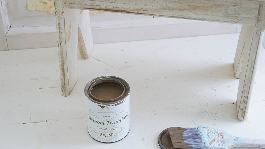
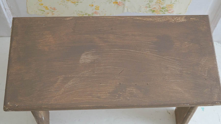
I pulled out my Mocha paint first and just did a light coat all over this little bench.
Once it was dry I took painters tape, and taped off medium size stripes.
Sorry, I thought I had taken a photo of that as I was doing it, but I didn’t.
I didn’t measure, I just eyeballed where I wanted my stripes to go.
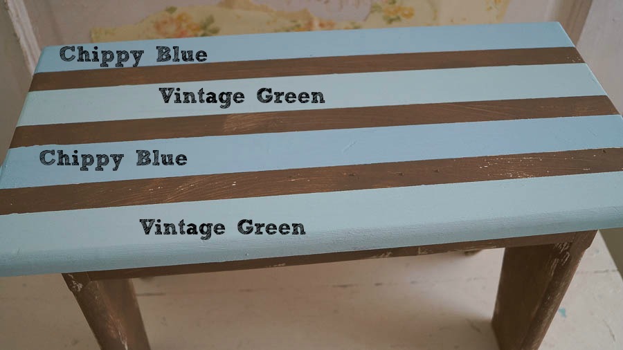
Then I painted one stripe Vintage Green and the other Chippy Blue.
Once the paint was dry I removed the tape.
Then I painted a coat of Vintage Green on the legs and sides.
Once I was done painting, I started to distress it, using my vinegar and water technique, along with my scissor technique.
I love how it’s started to look aged, but it still was not enough for me.
So, I used a little Muddy Pond wax all over the whole piece.
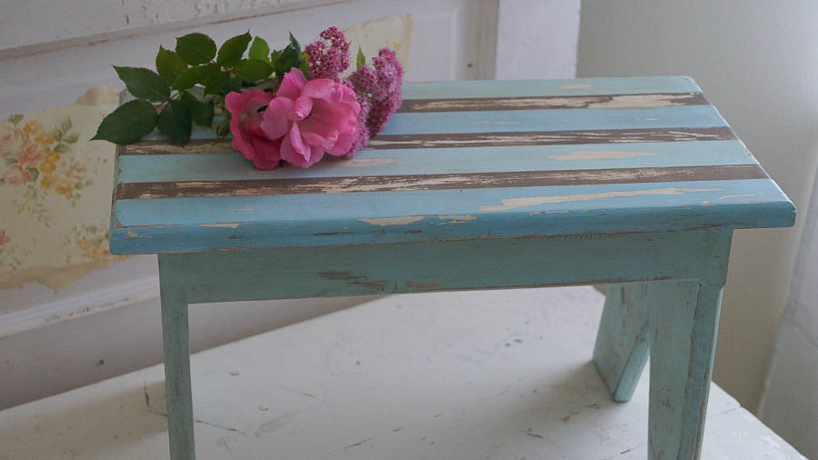
Here is the piece completed.
But let’s go back and look at those two colors again.
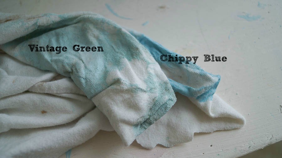
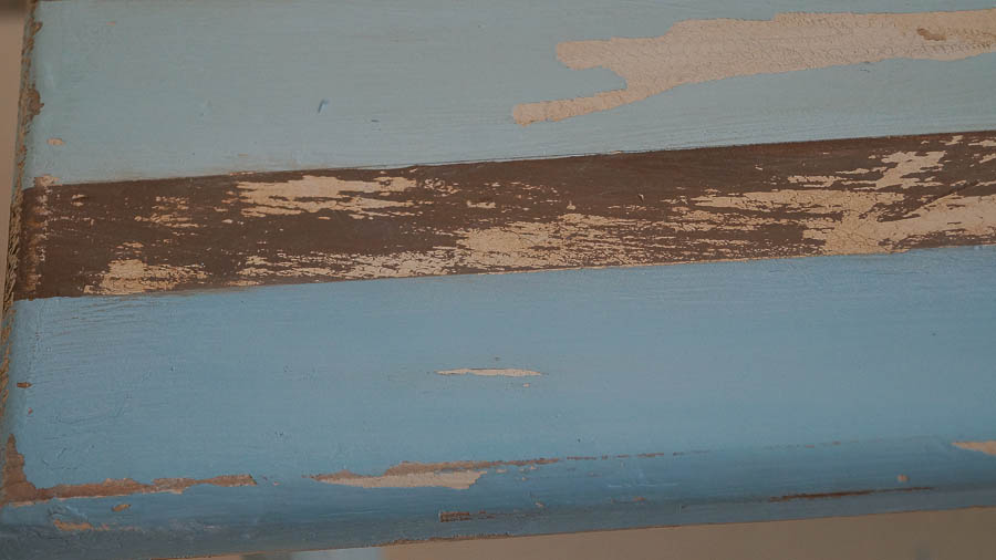
Can you see Vintage Green and Chippy Blue?
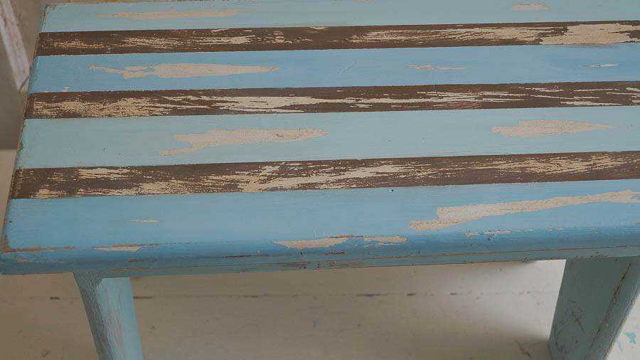
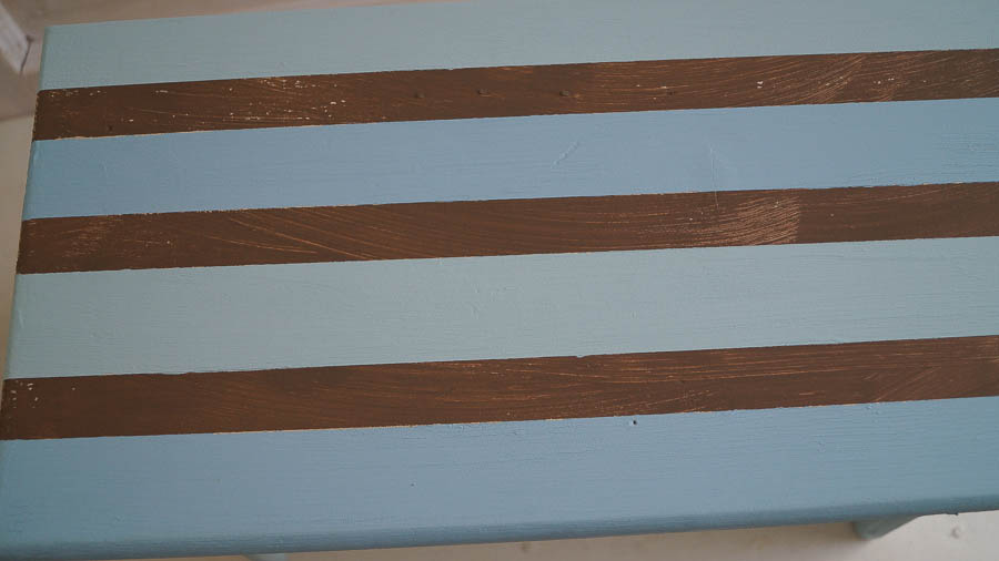
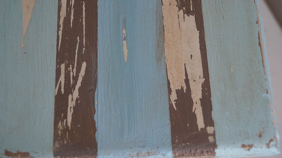
Here is a closer look.
I didn’t edit these photos much because I wanted to share the true colors.
Below you can see the colors with Muddy Pond.
I really love the soft color of the Vintage Green.
But as I said I was getting several people telling me they thought the two colors were too similar.
So, Vintage Green will be getting a makeover.
It’s hard to design colors when you are not actually at the plant seeing the colors side by side as they are created.
But I really felt they were different colors.
Still Vintage Green will have a little more green in the next batch.
I really do love this sweet little bench, I think it will make it into my screened porch.
The colors will work perfectly.
*************************************
Still waiting on my curtain rods for my porch, hoping they will arrive tomorrow.
Can’t wait to finally share my porch completed!

I can definitely see a difference between the two, Anne! Vintage Green is a bit more “minty”. I adore them both on your little bench, and can hardly wait to see the big reveal of your porch! We gave our contractor the go-ahead with our screened in porch and will be meeting with him this week. I am so geeked! 🙂
xoxo laurie
Yay how exciting!!!! I cannot wait to see it!
I absolutely love this little stool Anne. I cannot see much difference but I also love your website.
Thanks so much Freda!
I love both colors Anne! I can see the difference between the two for sure. Love that you started your own line.
I also love your new blog design. Mine needs a makeover so bad, but I’m so darn lazy :)))
sending hugs…
Thank you June! It’s been a dream of mine for a long time! Thanks so much, Launch Girls designed it for me 🙂
Anne i can tell the difference in the two,and they look wonderful together.The bench looks great.
Thanks so much Marlene!
I love this blog and hope to hear more from you. I would like to know: Why did you put down the Mocha paint first? I love the vintage green! I hope you don’t add too much green to it in the factory. Thank you for your ideas.
Thanks so much Maryjane!