Decorating Mistakes To Avoid
Please don’t freak out this isn’t going to be a shaming post telling you that you need to follow these steps or else. This is just a guide about decorating mistakes many of these decorating mistakes I’ve made myself. I’m going to be the first one to admit that I don’t always follow rules. I mean, I wear white after Labor day and I don’t always wear a makeup primer, although I should. And sometimes I go swimming before waiting an hour. I’m such a rebel!
Even if you’re a bit of a rebel like me, you still need a guide to help you as your decorating your home. You don’t have to follow these step by step just use this to guide you. So, are you ready to get started?
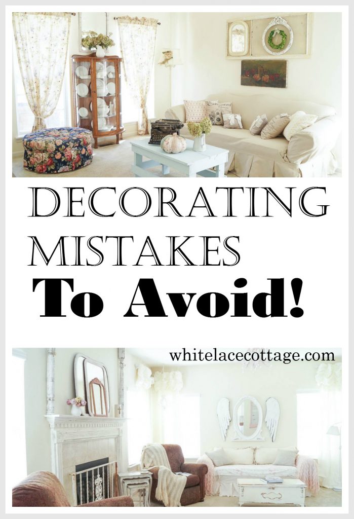
Top Decorating Mistakes And How To Avoid Them
- Too Much Clutter- Well that’s a no brainer right? Well, I have to admit that I’ve gotten lost in this one. Here’s an example of one of my decorating mistakes. I used to have this bad habit. I’d be out shopping, find a new treasure and instead of rearranging or weeding things out, I’d just add it to the pile of stuff I already had. And eventually that nice vignette that I had going on would start looking like a pile of…well you know where I’m going. So instead of adding an adding, think about taking something out. I call this the one in one out rule. If you want to bring something new in, then something needs to come out. This helps keep your vignettes fresh and not cluttered.
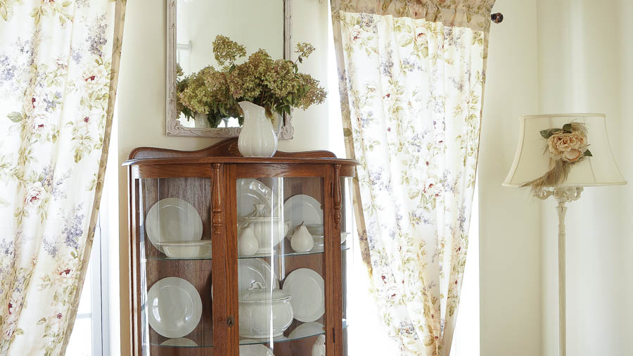
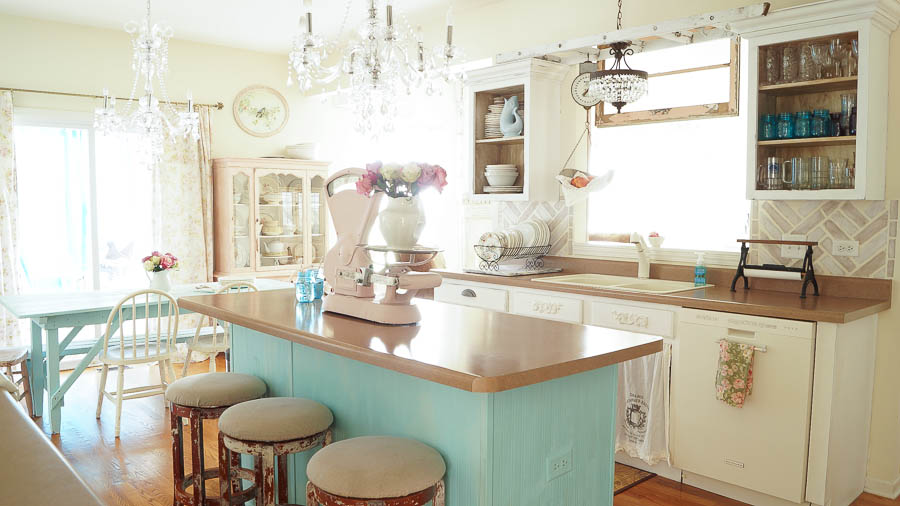
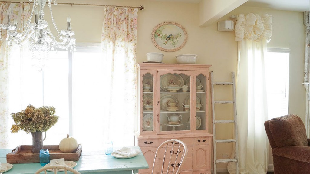
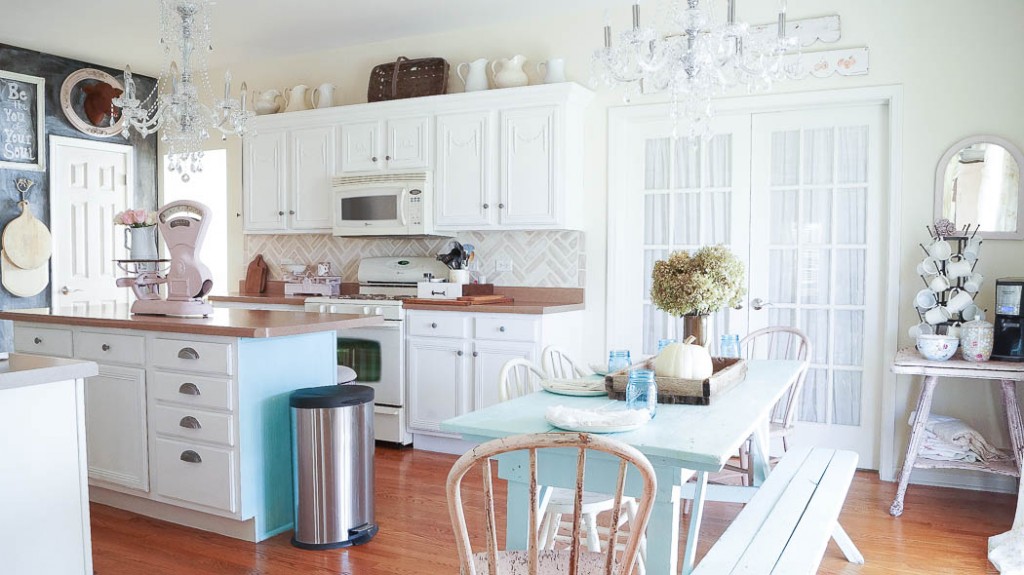
- Way Too Many Mixed Styles Or Themes- I love so many different styles from shabby chic, to French country, and farmhouse chic. And these can all work beautifully together if you do it right. So how do you mix styles? You need to make sure that you use pieces from each of the style with the similar shapes, colors. In my kitchen I mixed my French Provincial china cabinet in with my farmhouse table and paired these with my crystal chandeliers, and my chippy furniture. See how all of this works together? But, If I had black metal rack and a pedestal table with a white curvy design, mixed in with red stools with roosters on my chair pads, that would look a little off. Can you see what I’m saying? So mixing styles is totally cool to do. Just make sure you’re mixing the styles the right way.
- Furniture That’s Too Big- This is probably one of my biggest decorating mistakes that I had to learn the hard way. It’s hard when you fall in love with a piece of furniture and you’re determined to make it fit into your room even though it’s too big. Just think of Cinderella’s step sister. If the shoe doesn’t fit it doesn’t fit. You can’t put an elephant in a shoe box right? Before you purchase a big piece of furniture measure first then measure again. I’m talking from experience because I’ve made this mistake myself. Sometimes it’s hard to visualize so take a photo of your room with your phone. If your out looking for a piece of furniture you’ll want a photo and measurements to assure that it will fit in your room.
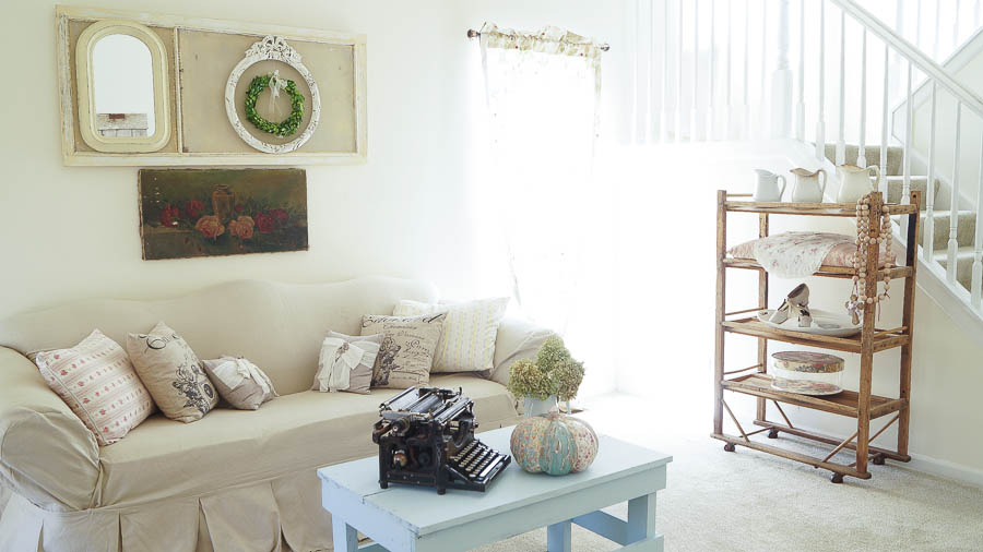
- Everything Doesn’t Have To Match- Back in the 1980’s decorating styles were very matchy-matchy. Wall paper matched the sheets, curtains, comforters, pillows. Yeah, you get the idea. Colors and patterns should compliment each other but you don’t want everything to match. Even in an all white room. It’s good to have different tones of white instead of one white color. I’ve had people ask me how do you decorate with white without it looking stark. And my answer is, by adding different white colors. Go look at paint samples. You can have 20 paint swatches of the same color but none of those will match perfectly. Choose colors that have the same tone but in different shades. I have a yellow white on my walls and my doors and trim in my home has a brighter white but still has warmth in the color so it all works. But when you see the colors next to each other you can see that they differ slightly.
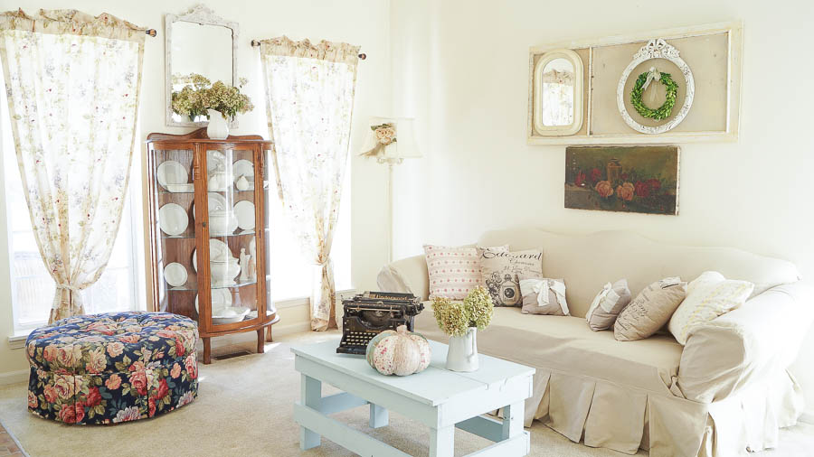
- Don’t Put Furniture Against The Wall- When you’re decorating a room you don’t want furniture all pushed up against the wall. Pull your sofa out slightly from the wall. This is a slight change but it will make a huge impact! Chairs can be placed on an angle. Make sure to keep seating areas cohesive for conversation.
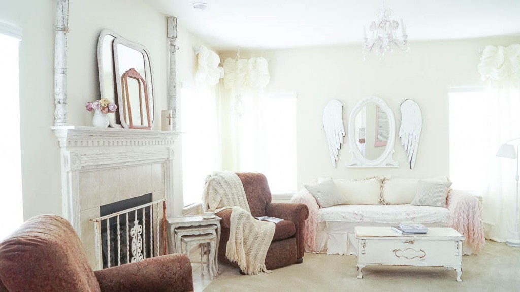
- Collections Or Clutter- When your decorating with collections its best to place them together instead of scattering them all over a room or a house. This is also true of photographs. I’m so guilty of this. Years ago I had lots of family photos with different frames, shapes and sizes scattered around my home. It was a cluttered mess! Placing collections or family photos together makes more of an impact. Another idea for photos is adding a gallery wall displaying your absolute favorite family photos. You can have the photos enlarged and placed into frames.
I hope that these tips and suggestions are helpful when your planning your room. Out of all of these tips which one is the most challenging? I’d love to know so please leave me a comment below.
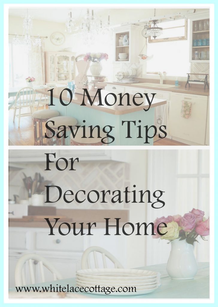
If you’re looking for ideas on how to save money while decorating your home make sure you read this article HERE.
My biggest challenge is too much clutter! When I go to estate sales and find something wonderful = I want to display it but have a hard time deciding what to remove. I also love the layered look but find it tricky to determine the line between layered and cluttered!
I struggle with my vignettes looking too much like store displays! I get teased that I should have price tags dangling from everything. We do run a small shop so I guess it’s hard for me not to arrange my Home like that. It just isn’t a good look or practical for your home. I need to apply the “one in, one out” rule more often but I tend to get sentimentally attached to items I’ve collected and don’t want to part with anything. I need someone to come in and do it for me! ?
I used to buy stuff til my whole house was cluttered. I started slowly giving it away to anyone who wanted an item and had a garage sale. Now when I find something i think I cannot live without, I just tell myself, just another thing to dust! That stops me from buying just about Everytime.
I sometimes match styles. Like country and victorian, as I love both styles. But not really.formal victorian. I love your site and have done some wooden furniture pieces per your instructions and love them. I too a rebel. Whatever works for me is my style.
Clutter it is hard to get rid of some stuff but i am getting a lot better. Thanks for all your help.
I will start by saying I love your website . : )
But my problem is storage and sentimentality. I have stuff that belonged to my mom and dad that I just can’t part with so it sits around gathering dust. I tell myself I have to weed this stuff then get overwhelmed and just rearrange everything. so it still looks cluttered and not put together very well.
Lisa, I’ve worked with so many clients who are just like you: Lots of sentimental objects and not much storage space. The first thing I tell them is you don’t have to get rid of anything but you can think of displaying just a few of the many treasured items at one time. Make vignettes on your dressers, end tables, dining tables, etc. Even if you have to store some things in shallow plastic boxes under your bed, you can still declutter and not get rid of those items with so many memories.
It’s using Anne’s “Something in/something out” idea in a little different way.
As a decorator myself, by and large the most difficult things to get people to think of changing are pulling the furniture away from the walls even just a 3″ or so (even in the smallest of rooms) and decluttering. If you can do those two things, you’re well on your way to a better look 🙂
Most of my work is restyling and consulting to answer “How can you refresh my look?” If there’s no budget to pay me anything but a consult, the client and I scurry around like crazy decluttering and repositioning furniture if possible. Within an half day’s work, the results can be amazing 🙂
All your points are spot on Anne! Great post! 😀