Man Cave
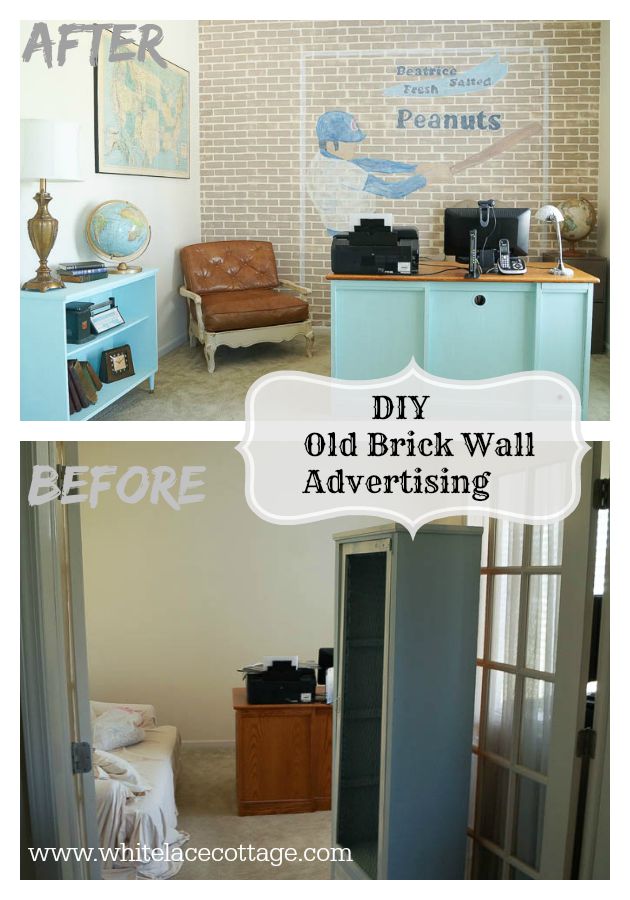
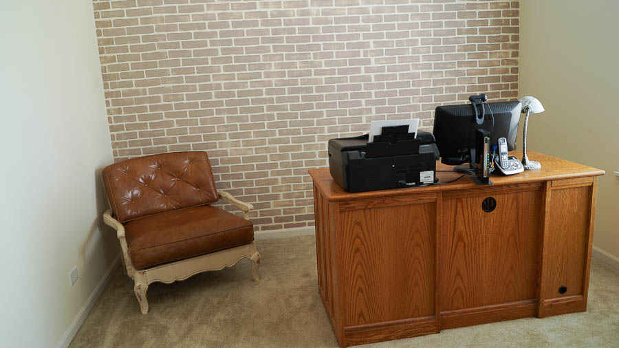
Before we talk about this Man cave reveal or I should call it a Man hut let me share what I did to this room before I added the advertisement wall. I added a faux brick stencil, you can read about that HERE.
This room is primarily used by my husband and sadly for him, it’s the only room in the house that’s his. Yeah, I’m a lucky girl. So when it came time to finally doing something in this room, I couldn’t make it all shabby chic and girly. I mean come on, he needs at least one room in the house that’s manly right?
(This is a sponsored post, and contains affiliate links)
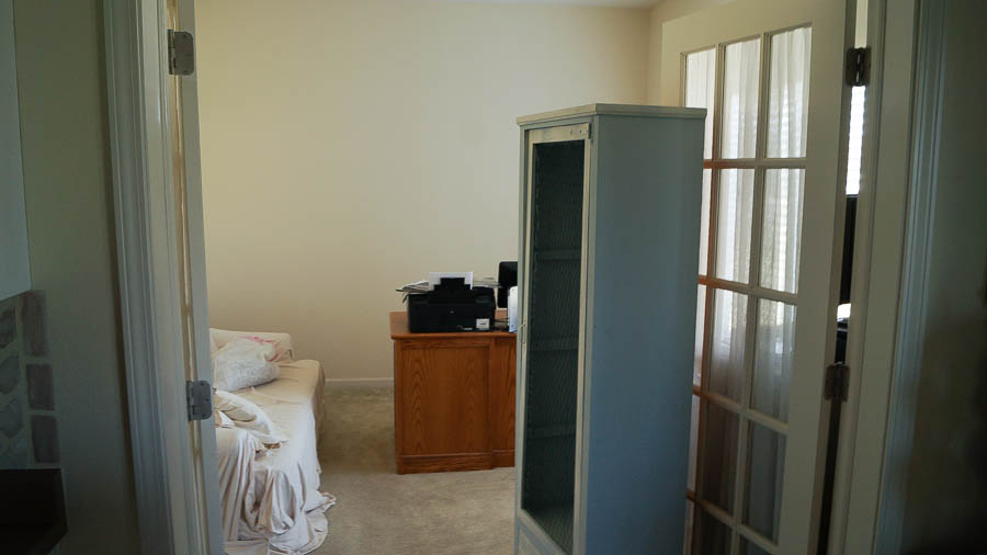
This is what the room looked like when we started. Well sort of, it didn’t have disheveled furniture tossed about. It was neat and clean and really boring. It doesn’t look like much of a Man cave, it’s just a very sad room.
So, I added a faux brick wall to this Man cave using a Cutting Edge Stencil. You can read more about that HERE.
After adding that stencil to this Man cave I could have hung something on my faux brick wall, painted a few pieces in this room, then called it a day. Well that’s just not my style. Instead I had something else in mind, something that would really make this a fun and unique room for my husband.
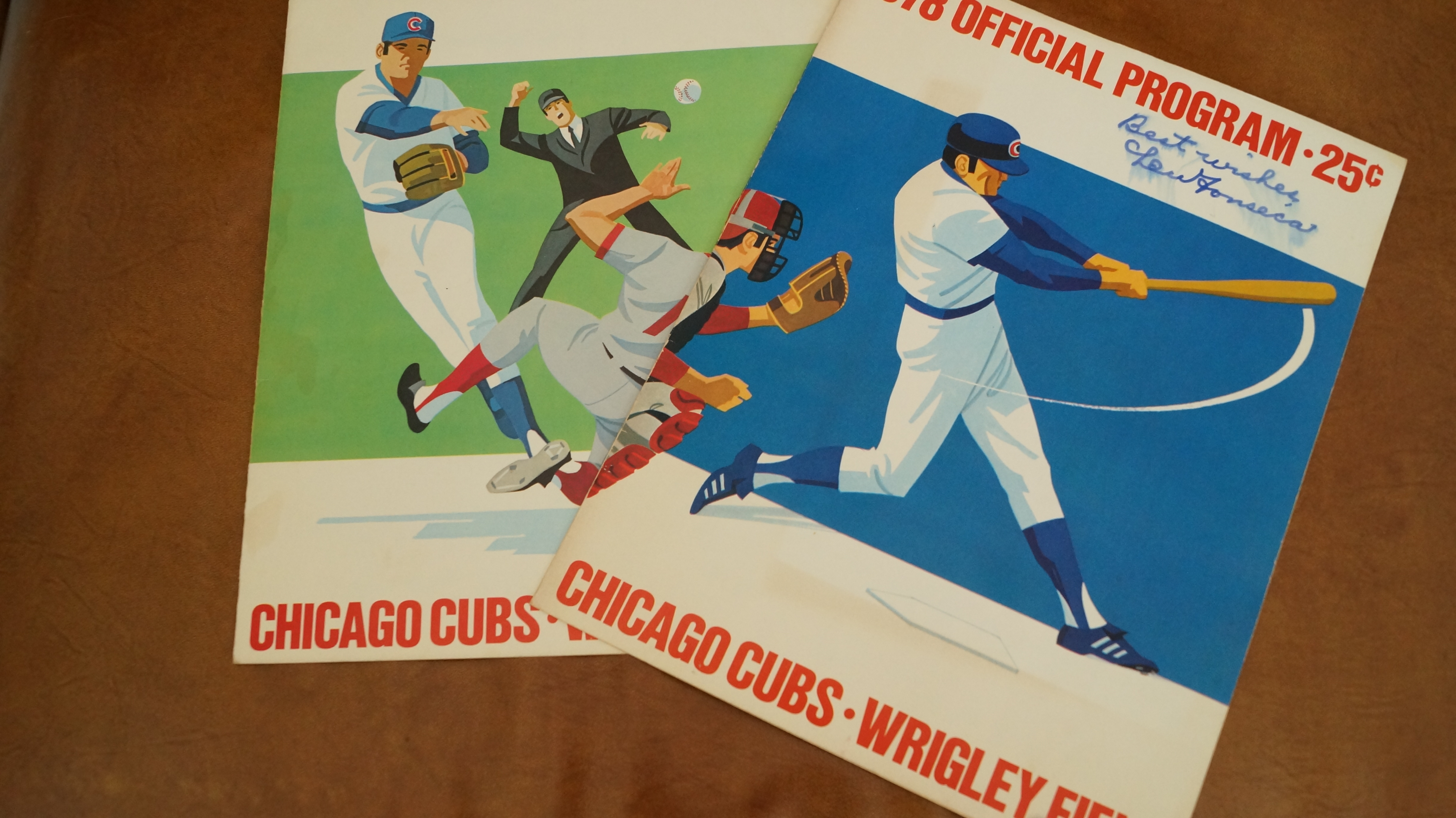
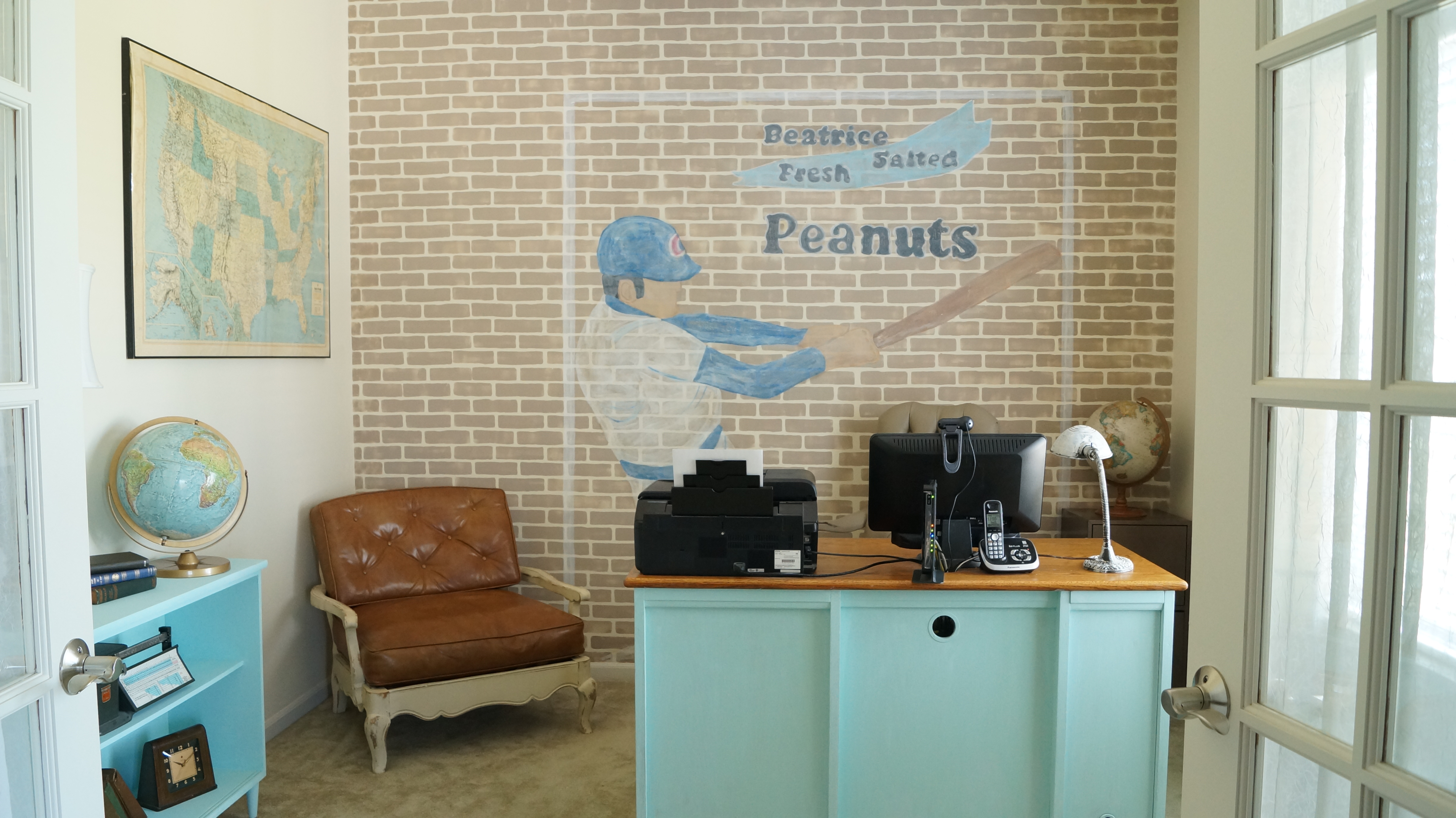
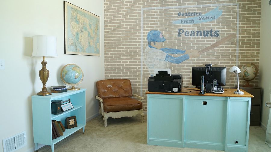
I had the idea of adding a faux advertisement wall in this Man cave. After searching for ideas, I found an amazing wall created by AKA design. She used a faux brick wall, not a stencil, but she created the look of an old advertisement on a brick wall. Her wall looks amazing, you should check it out! That’s the look I wanted! So now I needed to decided what advertisement I was going to use on my wall. My husband really enjoys sports, so I started looking for vintage graphics on line, but I wasn’t finding any. Until last week. My daughter and I were out shopping at garage sales, and came across an estate sale. Where I found a set of vintage baseball programs with his favorite team, the Chicago Cubs.
Next I contacted a friend and asked her if I could borrow her projector. This was my first time, not only stenciling a brick wall, but creating a mural on a wall. The graphic looked pretty simple, but it wasn’t.I used chalk to trace out my photo.
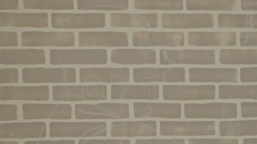
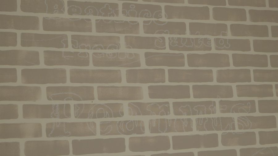
Sorry I have no photos to share as I was actually doing this. The room has to be very dark to do this, and still it was hard seeing what I was doing. Especially since I wear reading glasses, it wasn’t an easy task. Here you can see the chalk outline of my photo from the next day. The peanut advertisement was created on picmonkey, but I was inspired by an advertisement that I saw inside the scorecard.
I wanted to tie in baseball with something in this Man cave. But I didn’t want to use a alcohol or tobacco ad. As a parent I don’t think that I would be setting a good example if I did that. So I thought peanuts were a good and safe advertisement for my wall.
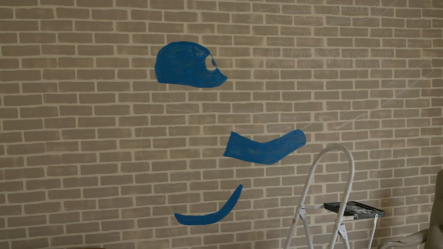
The next day I took out my acrylic craft paints and started painting my graphic. At this point it almost looks like the invisible man, it’s sort of creepy.
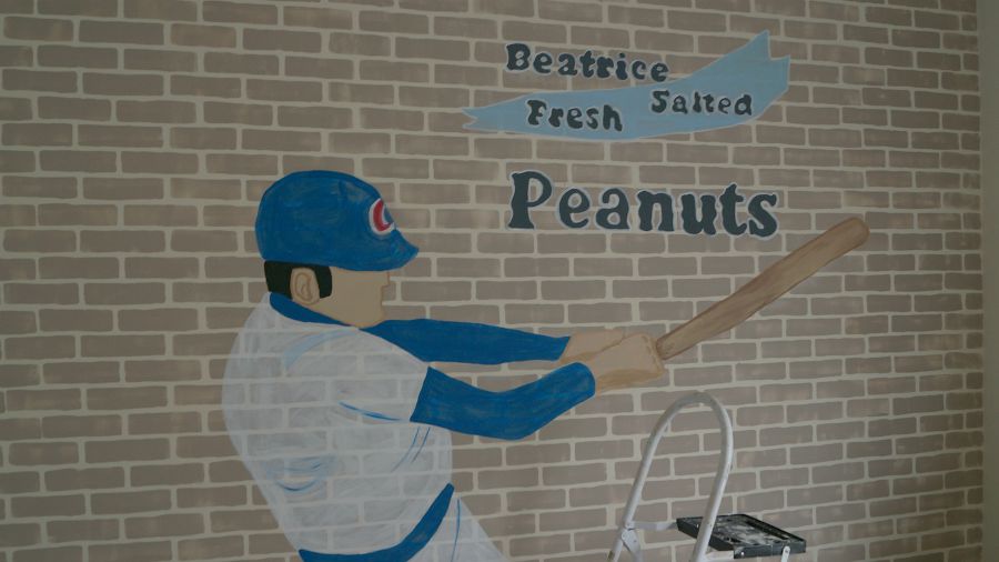
But as I was painting and filling in the design it all started to come to life. Then I started working on the advertising graphics.
Once it was completed, it looked too new to me. Remember, I wanted this to look old. I took out a sanding block and started sanding my graphics down. I was careful not to sand my faux brick stencil.
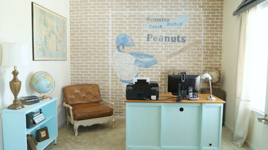
Sanding it down seemed to bring out texture in the bricks and the graphic, which made it look like it was indeed painted on a brick wall. But something was still off, it was still too new to me. I did like the brick showing through, but it needed to look more vintage and old. Next I pulled out my white acrylic paint and applied a wash of white over my graphic image. To create the wash I mixed my white paint with a little water. I didn’t want it too watery so it was drippy, but just enough to make the paint transparent. I finally got the look I wanted. But I still needed something else….ah, a border. I framed out my graphic using painters tape, then applied that same watered down white paint to my border. Yep, I’m liking the way this looks now in his Man cave. But I think I should have placed the baseball player to the left more. When my husband is sitting at the desk, it looks like he’s going to get hit in the head with a baseball bat.
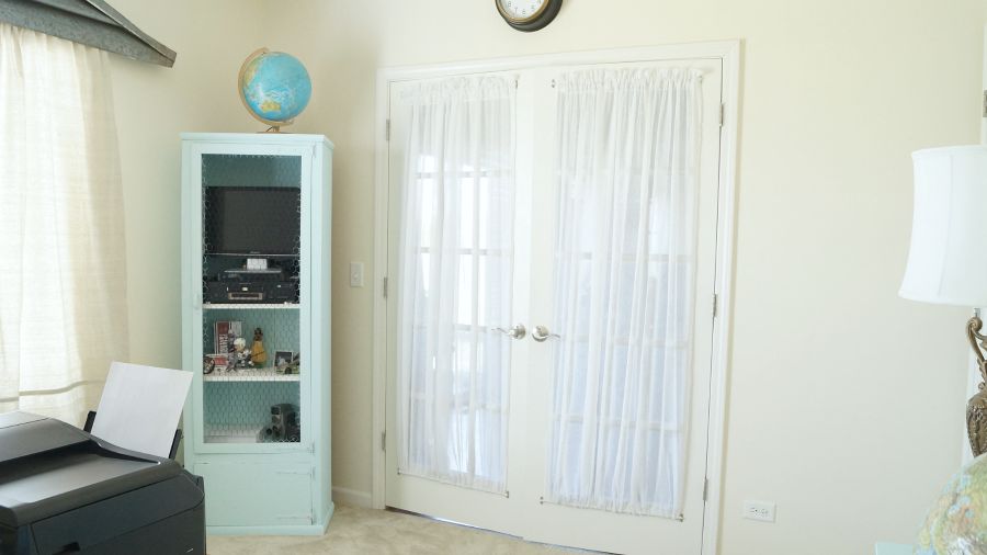
Now, let’s talk about the rest of this room transformation. This old chicken wire cabinet was in this room, with a hodgepodge of things. I purchased this many years ago at a thrift shop. In fact at one point I had it for sale when I was renting space at the antique mall. When it didn’t sell, I decided to keep it here with me.
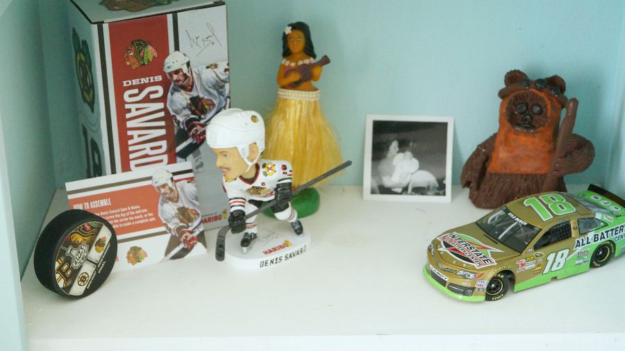
I painted it using a mix of Vintage Green and Chippy Blue, from my signature line of paint colors. We added our TV to this cabinet, as my husband enjoys putting a game on while he’s working. I did measure before adding the TV, but let me tell you, it’s a tight fit! And yes, once this door is open on the cabinet you have a perfect view of the TV. This collection is very eclectic, from his hockey bobble head, to a Star Wars figure my daughter created in art class. The sweet photo is my husbands Mom holding him as an infant.
Underneath this cabinet we now have great storage for the supplies in this room. In the corner we added a thrift store filing cabinet.
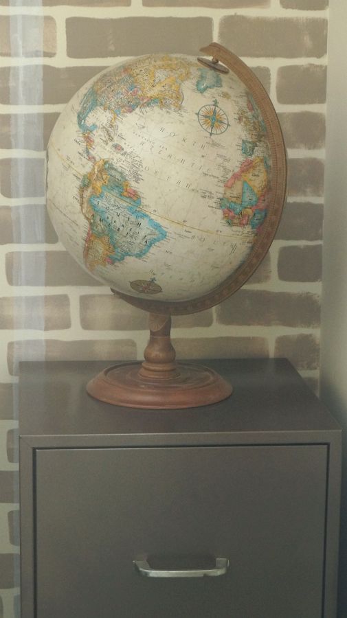
I’ve had this filing cabinet for years, and I used to use it when I was couponing. That’s a whole other story for another day, but I stopped most of my couponing because we were eating very unhealthy. Anyway, I added a coat of spray paint Rust-Oleum hammered copper to this file cabinet. It gave it a nice update with a coat of paint. It looks like a brand new piece! I bet your shocked I didn’t give it a chippy look. Well this room is for my husband not me, remember this is his Man cave hut.
The desk was painted that same mixture of Vintage Green and Chippy Blue.
I decided to keep the top of the desk as is. I haven’t decided whether to repaint the desk chair, so for now it’s staying as is. That chair in the corner was a thrifty find several years ago, it was $4.99! It fits in this room perfectly and it’s really comfortable too! I kept the color as is on the chair.
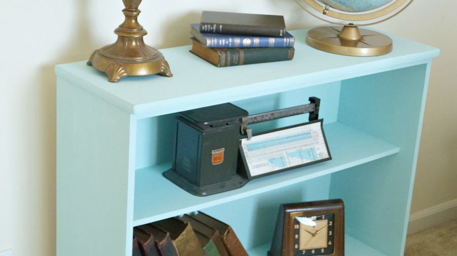
That side table/ book case was one that we’ve had for several years. It was at one time in my daughters room as a book case. And yes it too was a thrift store find for $5.00. I purchased legs from Menards and added them on the bottom of this piece.
This was also painted the same color combination as the desk and TV cabinet. Although I ran out of paint, so I’ll need to go over it with another coat of paint. My husband is not only a sports fan, but he also enjoys maps and globes.
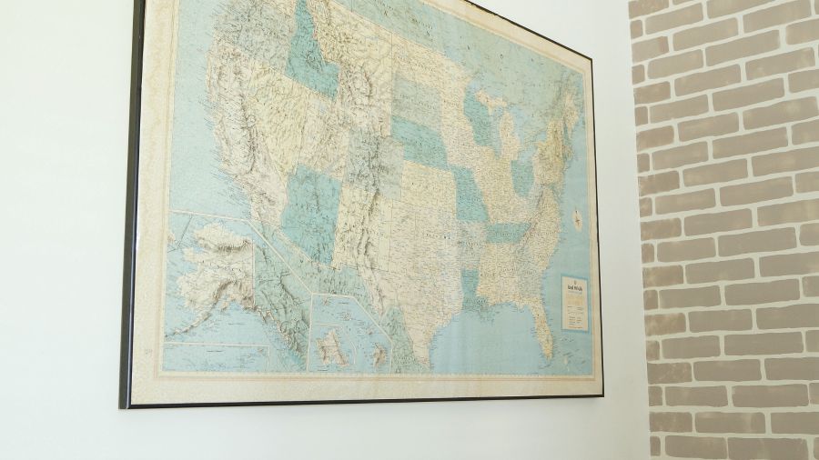
We already had this map and globes in the room, but they are now showcased much better.
As you can see my inspiration for the furniture colors came from that map that was found many years ago for $1.00. It’s not a fancy map, but I really love how old and faded it is. The bluish turquoise colors are perfect! They say it’s better to have collections grouped together in a room and not scattered. But I didn’t have enough room on the table to add the globes without them looking cluttered. Even a pair of two looked cluttered, so they are scattered around the room. Yeah, I know, I don’t follow rules. I’m such a rebel!
I kept the old vintage books and scale in this room, it gives it that industrial look I was going for. But I still kept his small collection of sports memorabilia, which I placed in the TV cabinet.
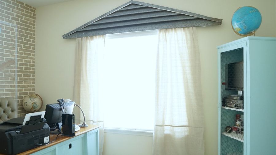
Let’s talk about my window treatment, shall we. Many of you may remember that this old dormer vent was in my living room., or maybe you don’t. Well I had this hanging on my living room wall for years. But I thought it would look really cool above this window. I attached the painters tarp fabric using velcro. No sewing was needed for this window treatment.
This curtain is for looks only and was never meant to open and close. We didn’t need the curtains to open and close because we have blinds. But I wanted to frame out the window. So that’s it!
Oh, the desk has holes for cords, it’s meant to face the other direction. But even with the holes, it looks much better this way, as opposed to the desk facing the other direction with the view of the cords and icky desk equipment stuff. The only items purchased for this room were the baseball programs,the painters tarp window treatment, velcro, spray paint, and the bench that I am now working on. Everything else was re-used, and repurposed from my own collection. And I might add that all of the pieces in this room with the exception of the desk, were purchase at a resale store.
Well this wraps up this room transformation. My husband is happy to have a space of his own, even if it’s a little space 😉
Resources-
Cutting Edge Stencils All Over Brick Stencil
Vintage Green Heirloom Traditions Paint
Chippy Blue Heirloom Traditions Paint
Use coupon code WHITELACE at checkout!


A very nice manly room Anne. 🙂
I really luv the blues And how they tie in with the map. Nice job on the mural. As one who have done MANY murals I can appreciate it 🙂
When doing a job, I draw out a story board to the clients specs and then project it on the wall for them to see the ‘ real’ size and colours. A projector is an amazing piece to own in my line of work,
Hugs, Gee
Thank you Gee 🙂
Fabulous room Anne. You and your husband must be thrilled with the result. All your hard work certainly paid off. Love the brick wall ,mural , turquoise colour in fact everything!!
Thanks so much Shirley! Yes, I actually enjoy sitting in here as well now 🙂
It looks wonderful. I really like your other rooms but I could easily sit in that chair and be happy too.
Thanks so much Wendy!
Hi Anne,
I love when you post DIY’s like this. That wall looks so awesome. Great job. You knocked it out of the park on this one. Pun Pun!!!!
Have a great week.
Kris
LOL, thank you Kris! My husband is loving his new room.
It turned out just great, Anne! You are so stinkin’ creative! I’ll bet that your hubby just loves his new space….and the fact that you created it for him just makes it even more special. What a wonderful wife you are! 🙂 Love it all!!!
xoxo laurie
Thanks so much Laurie <3 And yes he LOVES it!
That is really cool Anne. I knew you were up to something when I saw the pins you were pinning.
LOL, yep! I love those old brick advertisements for sure. I hope I wasn’t driving you nuts with my feed LOL!
Hi Anne, I’m not sure what’s happened to your site, but I’m getting an ad across the page which is making it almost impossible to enjoy reading your blog.
Do you know what’s happened?
Cheers
Oh no! Sorry Philippa, I will look into that. Thank you for letting me know.
Fantastic! You are such a gem….I love the manly room and I am sure hubby does too.
Thank you so much Kim!
I also love the blue color, and how it ties in with the map and globe. The wall treatment is great! My husband is a Cubs fan too, and he would love it.
Thanks so much Jann! Yay, happy to hear another Cubs fan 🙂
You did a great job on the room Anne and as always were thoughtful of others. The blues tie in wonderfully with the map and globe. I love what you have done it is a perfect room for its purpose.That brick wall is amazingly wonderful.
Thanks so much Marlene!
Wow, that really says how I feel about your hubs room. I’m ashamed to say the other 2 very small bedrooms are taken up with my crafts and sewing room so hubs doesn’t have his own room. We share the mud room for our computers. We have small 16×80 mfg.single wide home so not much extra room . He does have say how the small shed is occupied, none of my “junk” or “stuff’ as he calls it is allowed.
You did such a great job on your hubs room, The mural over brick wall is excellent. If that’s your first time making a mural you did awesome job. I’d love to have one of those projectors, they are invaluable. Have great week
Thanks so much JaneEllen! I am very grateful my friend lent me her’s. Have a great week 🙂
Fabulous!!!! Root, root, root for the Cubbies…and for Anne’s awesomeness!
Ha….thank you Janet <3